My Account
My Slides
Search by Category
Pricing
Templates
View All Templates
Download Template Slides
✦ AI Search
Feedback
Login
Logout
Get Started
Browse all Slides
Browse all Slides
Create a FREE Account
Instant access to 1,000+ real slides from top companies like McKinsey, BCG, Goldman Sachs, Google and many more!
First Name
Last Name
Email
Password
I agree to all
Terms & Privacy Policy
Thank you! Your submission has been received!
Oops! Something went wrong while submitting the form.
Have an account?
Sign in
Saved Slides
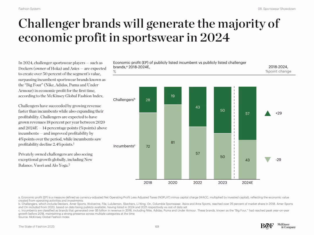
Split design with text on left and stacked bar chart on right comparing challengers vs incumbents over years
Financial Performance
Consumer Goods
This slide reveals how challenger sportswear brands like Deckers and Asics are surpassing incumbents like Nike and Adidas in economic profit. The chart compares EP share between 2018–2024E, showing a clear shift toward challengers. The analysis explains challengers’ faster revenue growth and stronger profitability, while incumbents show decline.
challenger brands, sportswear, profit, incumbents, EP, growth, 2024, Nike, Asics
Mixed Chart
McKinsey
Saved
Slide with two US maps showing the growth in branch network coverage from 2017 to 2022, with a focus on demographic coverage and strategic goals.
Strategic Planning
Financial Services
Details the strategic expansion of the bank's branch network coverage nationwide, aiming to increase market and demographic reach, and to deepen community trust.
network coverage, strategic expansion, branch network, banking, demographic coverage, market reach, community trust, Chase, strategic goals
Multiple Chart
JP Morgan
Saved
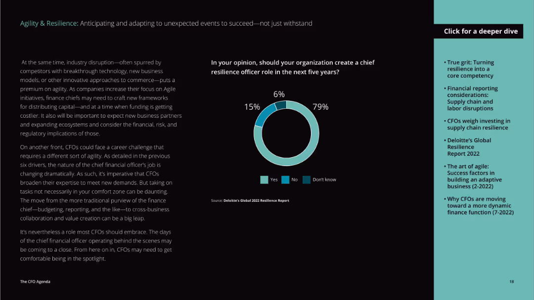
This slide has a dark background with teal and white text. It features a donut chart showing opinions on creating a chief resilience officer role, and text on industry disruption.
Strategic Planning
Professional Services
Examines the need for a chief resilience officer, highlighting industry disruption and evolving CFO roles, and evaluates opinions on resilience roles.
resilience, CFO, industry disruption, agility
Mixed Chart
Deloitte
Saved
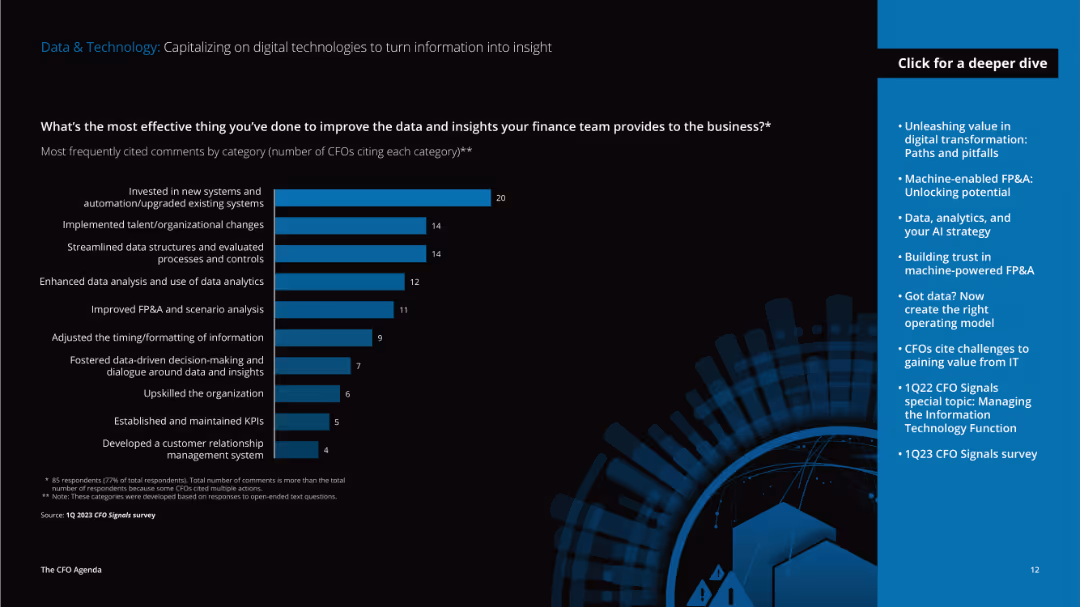
This slide has detailed text on the left discussing data improvement strategies and a vertical column chart on the right showing effective actions taken by CFOs to enhance data insights.
Technology and Digital Transformation
Technology & Software
The slide discusses effective strategies CFOs have implemented to improve data and insights, such as investing in new systems, implementing organizational changes, and enhancing data analysis capabilities.
data, technology, improvement, systems, organizational changes, data analysis, insights, CFO, strategies, implementation
Mixed Chart
Deloitte
Saved
The slide features multiple column charts comparing formal and informal DEI programs from 2016 to 2022. Categories include hiring, recruitment, mentorship, leadership development, promotion, and retention.
Human Resources and Talent Management
Professional Services
The slide provides data on the adoption rates of various DEI programs, both formal and informal, across several years.
DEI programs, hiring, recruitment, mentorship, leadership development, promotion, retention
Multiple Chart
Deloitte
Saved
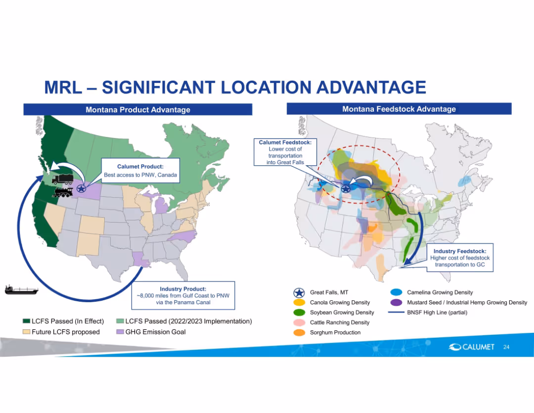
Side-by-side U.S. maps with product and feedstock advantage overlays; icons for transport/logistics.
Strategic Planning
Energy & Utilities
Shows Montana Renewables’ locational advantage in product distribution and feedstock sourcing. Highlights shorter routes, cost advantages, and favorable policy zones for the company versus competitors.
logistics, feedstock, Montana, PNW access, Calumet, LCFS, renewable fuel, location advantage, transport cost
Multiple Chart
Goldman Sachs
Saved
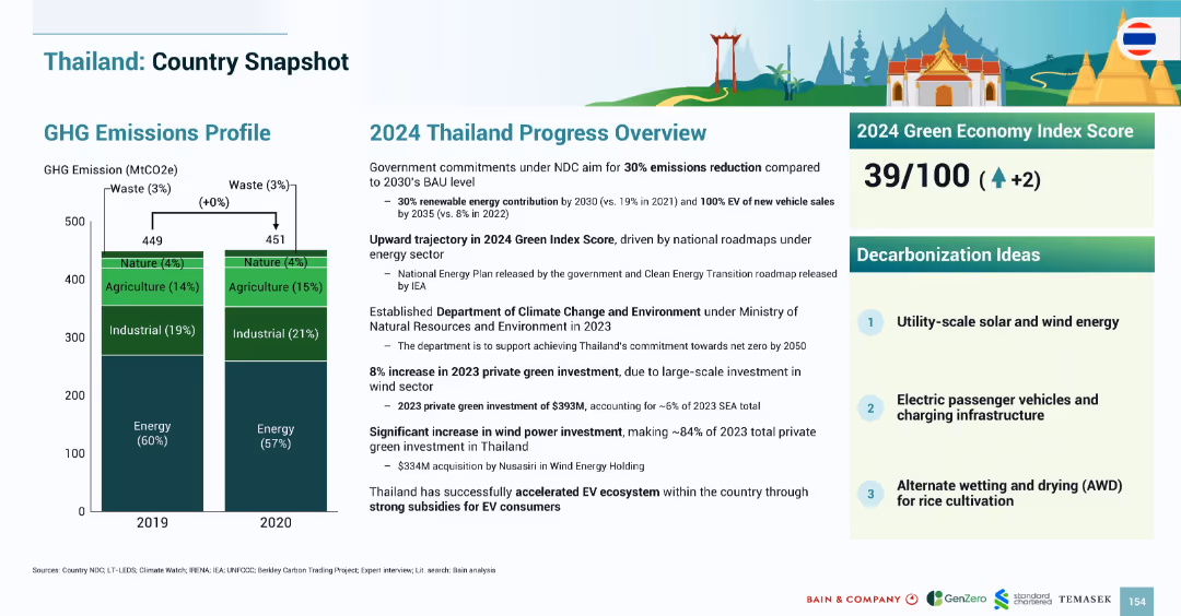
Layout mirrors previous country snapshots with emissions bar chart, 2024 progress narrative, index score, and decarbonization ideas.
Strategic Planning
Government & Public Sector
Thailand’s emissions profile remained stable between 2019–2020. The 2024 Green Index Score increased to 39/100. Green investments reached $393M in 2023, driven by wind power. Strategies emphasize EV adoption, utility-scale renewables, and rice cultivation water management.
Thailand, emissions, EV, wind power, solar, agriculture, AWD, 2024, Green Index
Mixed Chart
Bain
Saved
This slide combines text and images, including a small bar chart, bullet points, and a large green-themed graphic layout. The visual elements support the content, emphasizing the environmental focus.
Risk Assessment and Management
Environmental Services & Sustainability
Discussing the strategic and environmental impacts of urban monitoring via Copernicus, this slide emphasizes the identification and management of environmental issues like urban sprawl and pollution. It presents urban monitoring as a crucial tool for sustainable urban planning and policy development.
urban monitoring, environmental impact, Copernicus, sustainability, urban sprawl
Linear Flow
PwC/Strategy&
Saved
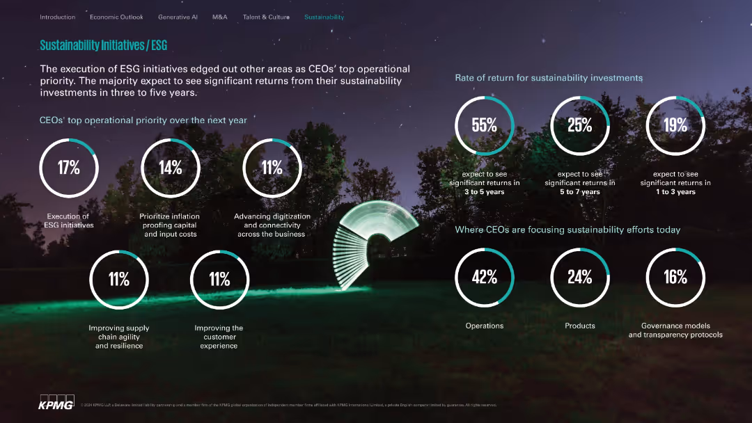
Nature-themed background with white circle stats; clean and segmented layout.
Customer and Market Segmentation
Environmental Services & Sustainability
Highlights ESG execution as a top CEO priority, expected investment return timelines, and primary focus areas like operations, products, and governance. Communicates optimism on sustainability ROI within 3–5 years.
ESG, sustainability, ROI, operations, governance, digital transformation
Single Chart
KPMG
Saved
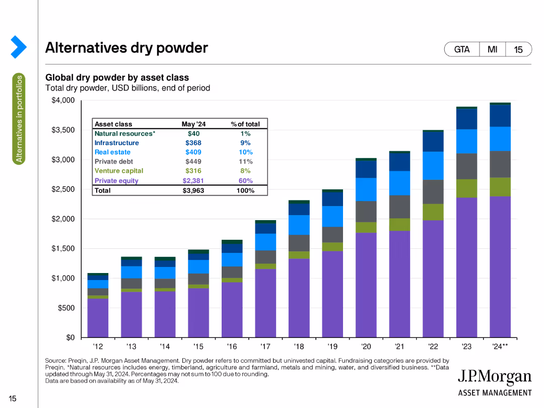
The slide presents a stacked column chart showing global dry powder by asset class in USD billions as of the end of May 2024. The chart uses different colors to depict natural resources, infrastructure, private equity, and other categories.
Investment Analysis
Financial Services
This slide details the amount of uninvested capital (dry powder) available in various asset classes, such as natural resources, infrastructure, and private equity, highlighting the total capital ready for deployment at the end of May 2024.
Dry Powder, Asset Classes, Uninvested Capital, USD Billions, Deployment
Single Chart
JP Morgan
Saved
This slide includes a circular chart representing Australian consumers' openness to switching to virtual primary care, with data on preferences for in-person versus virtual consultations.
Market Analysis and Trends
Healthcare & Pharmaceuticals
It discusses Australian consumers' openness to virtual primary care consultations, highlighting the proportion willing to switch from in-person to virtual consultations.
virtual primary care, consumer preferences, Australian consumers, healthcare, in-person consultation
Mixed Chart
EY
Saved
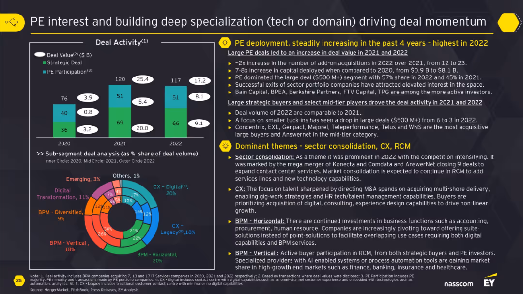
Bar chart of deal activity by type and doughnut chart of subsegment splits; descriptive blocks on PE trends and sector consolidation.
Mergers and Acquisitions
Financial Services
The slide focuses on growing private equity deployment and thematic investments in sectors like CX, BPM, and Digital. It showcases how sector consolidation and focus on specialized capabilities like automation and analytics have increased deal momentum, with more exits and large deals occurring in 2022.
private equity, specialization, CX, BPM, M&A, deal activity, sector consolidation
Multiple Chart
EY
Saved
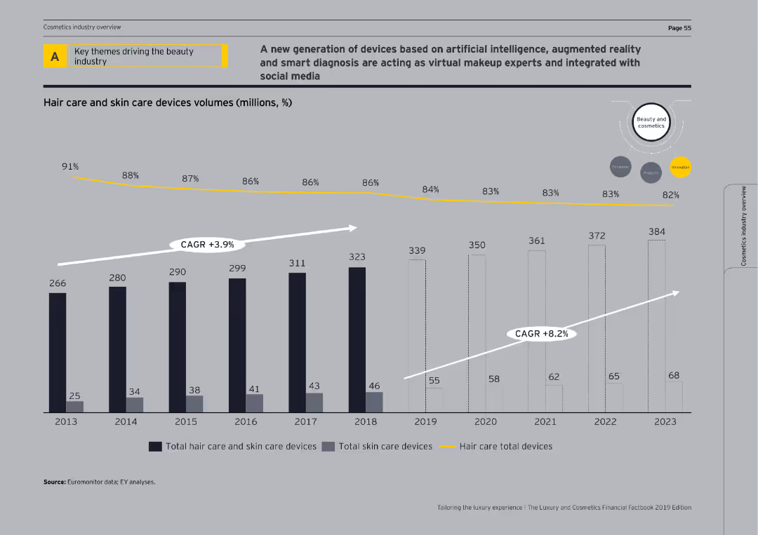
This slide features a column chart showing the volume of hair care and skin care devices from 2013 to 2023. Annotations indicate CAGR for total skin care and hair care total devices.
Market Analysis and Trends
Consumer Goods
The slide highlights the trends in the beauty industry focusing on the adoption of AI, AR, and social media integration in virtual makeup and smart diagnosis devices.
AI, AR, beauty industry, market trends, CAGR
Single Chart
EY
Saved
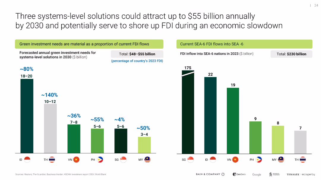
Two bar charts compare forecasted green investment needs and actual 2023 FDI inflows for SEA-6 nations
Investment Analysis
Environmental Services & Sustainability
Highlights investment potential of systems-level green solutions across Southeast Asia, showing material FDI alignment for future capital inflows in sectors like EVs and renewable infrastructure.
green investment, FDI, SEA-6, 2030 forecast, decarbonization finance
Multiple Chart
Bain
Saved
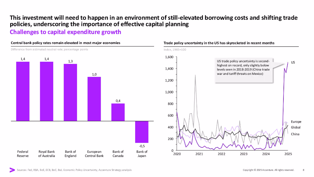
Two-part layout: bar chart of interest rates on left and line graph on right showing trade policy uncertainty. Use of purple for main metrics and annotation callouts.
Risk Assessment and Management
Financial Services
Highlights challenges to capex, including elevated central bank rates and increased trade policy uncertainty (especially in the US). Shows both monetary and geopolitical risks impacting capital planning.
capex, policy rates, risk, trade policy, investment, borrowing costs
Multiple Chart
Accenture
Saved
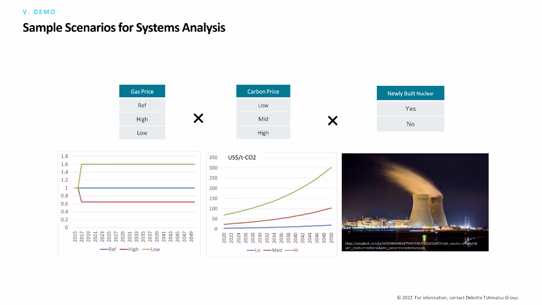
The slide compares various scenarios for systems analysis, including gas prices, carbon prices, and newly built nuclear. It features a mix of comparative tables, line charts, and an image of a nuclear power plant.
Risk Assessment and Management
Industrial & Manufacturing
The slide presents different scenarios for analyzing systems in the energy sector, focusing on how variables like gas and carbon prices, as well as nuclear infrastructure, impact overall performance and risks.
Systems analysis, scenarios, gas prices, carbon prices, nuclear
Multiple Chart
Deloitte
Saved
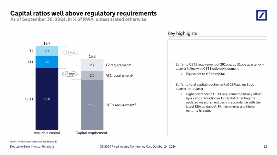
Vertical bar chart compares available capital to regulatory minimums (CET1, AT1, T2). Labels show surplus in basis points and € terms. Key messages summarized on the right.
Regulatory and Compliance
Financial Services
Communicates that Deutsche Bank maintains a strong capital buffer above CET1 and total capital requirements. Slide breaks down capital components and the regulatory thresholds, while noting quarter-on-quarter improvements and changes to T2 calculation rules.
CET1, AT1, T2, capital buffer, regulatory compliance, EBA guidance, capital surplus, 2024
Mixed Chart
Deutsche Bank
Saved
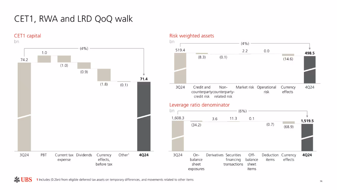
Three waterfall charts (CET1 capital, Risk-Weighted Assets, Leverage Ratio Denominator); neutral style with light beige and gray color coding.
Financial Performance
Financial Services
Shows quarter-over-quarter movement in UBS’s CET1 capital, Risk-Weighted Assets (RWA), and Leverage Ratio Denominator (LRD) from 3Q24 to 4Q24. Breaks down factors like tax expense, dividends, market risk, and currency effects contributing to changes in these key regulatory capital metrics.
CET1, RWA, LRD, capital movement, UBS, risk, leverage ratio
Multiple Chart
UBS
Saved
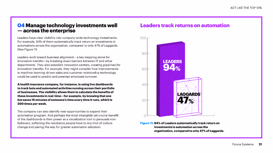
The slide contains text and a vertical column chart. The chart compares the percentage of leaders and laggards in tracking returns on automation investments.
Investment Analysis
Financial Services
The slide emphasizes the importance of tracking technology investments, highlighting that a high percentage of leaders track returns on automation investments compared to laggards.
technology investments, automation, leaders, laggards, tracking, returns, financial services, comparison
Mixed Chart
Accenture
Saved
Same format as prior slides. Horizontal bar chart with country-level percentages under "Important" and "Not important" responses.
Market Analysis and Trends
Government & Public Sector
The chart presents international responses on whether defending one’s country from criticism is an important trait. Responses are more divided here compared to previous slides, with a lower average (73%) considering it important. Cultural and regional differences are evident.
patriotism, national pride, defense, criticism, public opinion, Ipsos, bar chart, national identity
Mixed Chart
IPSOS
Saved
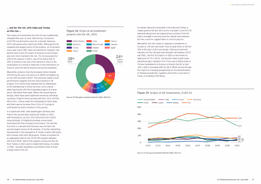
The slide shows a line chart detailing UK projects by activity from 2012 to 2021, with lines for different types of activities like business services, sales.
Market Analysis and Trends
Financial Services
This slide provides an overview of the distribution of UK projects by activity over the past decade, highlighting changes in business focus and investment.
UK projects, activity, business services, 2012-21
Multiple Chart
EY
Saved
Column chart depicting agreement levels by different age groups that they need to do more for their mental well-being, with color-coded segments showing various levels of agreement.
Customer and Market Segmentation
Healthcare & Pharmaceuticals
Focuses on the challenges of mental health across age groups, emphasizing that younger individuals feel a more acute need to address mental well-being compared to older age groups.
mental health, age groups, challenges, survey, agreement
Mixed Chart
IPSOS
Saved
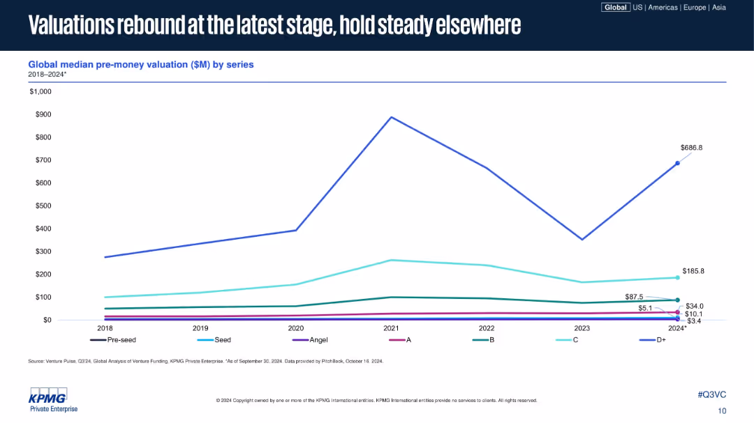
Line chart similar in style to previous, plotting median pre-money valuations across funding series; D+ shows significant increase in 2024; uses same visual and color scheme.
Investment Analysis
Financial Services
The slide displays median pre-money valuations across venture funding series from 2018 to 2024, showing that while early and mid-stage valuations are flat, late-stage valuations (Series D+) have seen a strong recovery. It emphasizes how later-stage optimism is rebounding first.
startup valuation, venture capital, pre-money, funding stages, D+ recovery, series B, investment climate, 2024, KPMG, VC metrics
Single Chart
KPMG
Saved
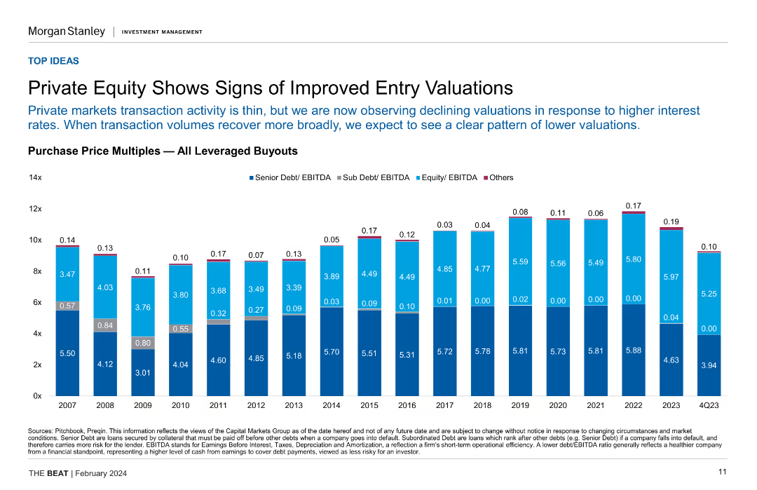
Column chart showing purchase price multiples for all leveraged buyouts over several years, highlighting senior and sub debt/EBITDA ratios.
Investment Analysis
Financial Services
This slide indicates improved entry valuations in private equity, with declining valuations due to higher interest rates, and compares historical purchase price multiples.
private equity, entry valuations, leveraged buyouts, purchase price multiples, investment analysis
Single Chart
Morgan Stanley
Saved
Contains multiple pie charts with percentages illustrating common pitfalls in deploying digital finance transformations, such as task-focused approaches and fragmented processes.
Risk Assessment and Management
Financial Services
Addresses the challenges and common pitfalls that financial departments face when scaling digital transformation efforts, with statistics on failure rates and issues encountered.
digital transformation, finance, scaling, deployment, common pitfalls, fragmented processes, task-focused, statistics
Mixed Chart
Deloitte
Saved
Next
If nothing, comes up, please save your slides first
Create a FREE account to continue browsing
Receive Instant Access to 1,000+ slides from companies like McKinsey, Google, and Goldman Sachs
First Name
Last Name
Email
Password
I agree to all
Terms & Privacy Policy
Thank you! Your submission has been received!
Oops! Something went wrong while submitting the form.
Have an account?
Sign in
Column Chart
Heatmap
Chevron
Org Chart
Infographic
Callouts
Timeline
List
Graphic
Picture
Process Flow
Diagram
Paragraph
Map
Table
Framework
Subtitle
Takeaway Box
Icon
Other Chart
Radar Chart
Waterfall Chart
Mekko Chart
Pie Chart
Scatter Plot
Line Chart
Bar chart
Bullet points


![Defending [COUNTRY] when it is criticized](https://cdn.prod.website-files.com/654e70fb59937215cac87b19/6899bb31df0232a8a24f5889_qvBeDt21lyNdAQo81I-B9odvh0kcc792ylPZrvKQH_Y.avif)